YHL · Brand Directions
Japanese / MUJI   Direction C1  ·  Rank #3 of 9  ·  gpt-image-2 9.6/10

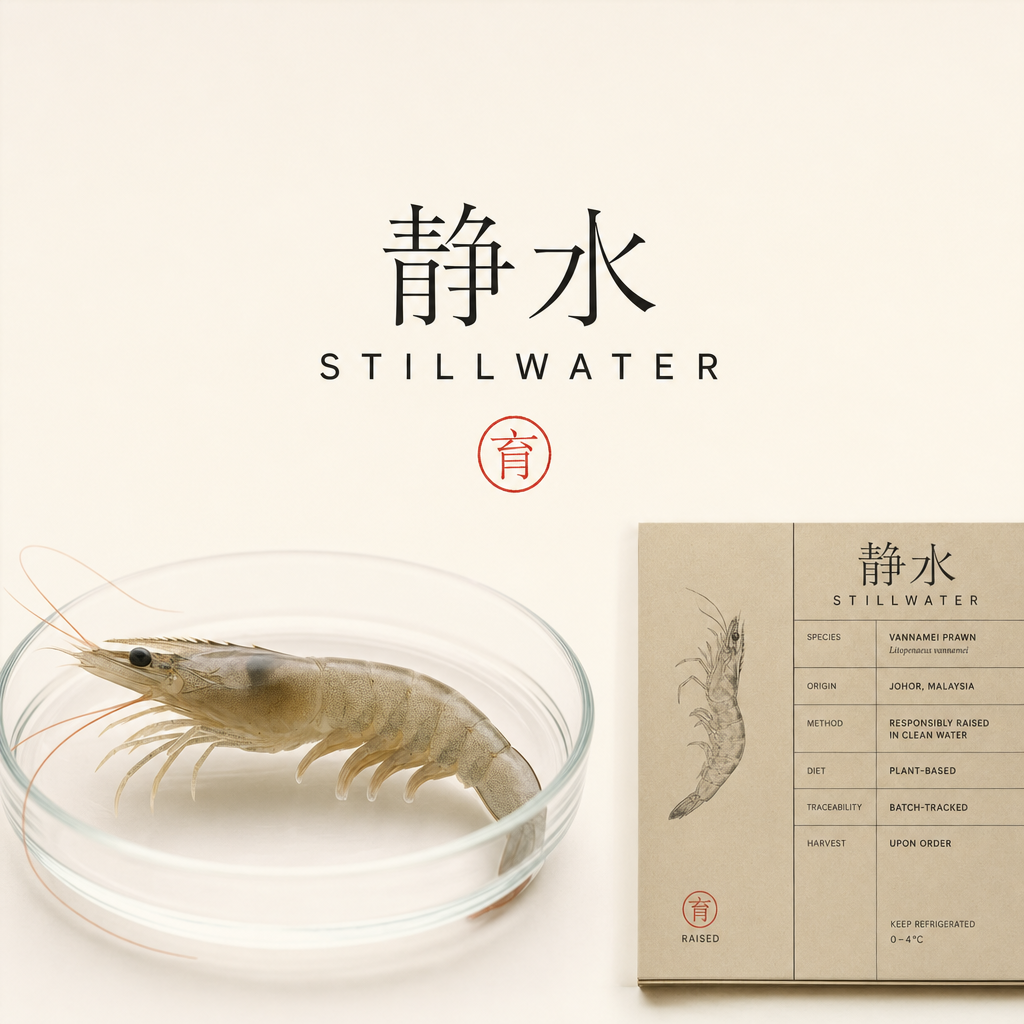
STILLWATER 静水

Raised, not taken. · 只养,不捕

Panel 72/100Buy-intent ~35% blended would buy/consider — SG ~41% (concentrated in sashimi-entertainer + affluent gifter), MY ~27% (drops on MUJI-idiom niche-ness + festive-warmth gap). Ultra-tier gift/festive intent thinner: SG ~14%, MY ~8%.
Generated brand key-visual — STILLWATER

AI-generated brand key-visual (gpt-image-2, reference-first · 9.6/10). Wordmark text is AI-rendered — to be reset by a designer.

Reference basis

Grounded in: MUJI · 天和鮮物 THO · SunnyHills — and this direction's own art-direction spec.

The identity

Full brand direction.

Sea-life story
STILLWATER tells "save the sea life" by SUBTRACTION and FACT, never by emotional plea — which is what keeps it honest and legally defensible (R88). Four moves, each borrowed from the research: (1) STATE WHAT IS OMITTED, the MUJI "we don't bleach the pulp, so the paper is beige" logic — the manifesto line is "No nets. No bycatch. No emptying the ocean. Just one still farm," set small in Mincho on unbleached kraft. It names only the specific things YHL genuinely does NOT do, so it never overclaims that aquaculture is zero-impact. (2) MA AS THE OCEAN LEFT ALONE — a single reverent specimen drawing of the vannamei prawn or dragon-tiger grouper isolated in a vast empty kraft field; the emptiness literally reads as a reef not dragged, a stock not emptied. (3) THE 育 SEAL — the one red chop compresses the whole promise ("raised, not caught") into a single trust-stamp, the way Suntory's washi series is punctuated by one red kizuna seal. (4) PROOF-AS-DESIGN — the genuine differentiators (single farm, Desaru 244ha, IMTA, probiotic-raised, antibiotic-free, Phi-Tik 49th-gen broodstock from the Nucleus Breeding Centre, ikejime grouper, sashimi-grade at harvest) are rendered as an honest, tabular spec-tag — the hero visual of the brand. Never a green-leaf badge, never "we save the ocean" as a headline; the emptiness and the seal carry the feeling, the spec carries the proof.
Positioning
The honest, no-brand premium live-seafood house — "the MUJI of the sea." Not the loudest, the cleanest. STILLWATER's entire value proposition is transparency made beautiful: farm ID, size count, harvest date and rearing method printed as the hero, not the fine print. It is premium via restraint (unbleached kraft, sumi mono, one red seal) rather than gold-and-red maximalism, and ocean-positive by honest omission (farm-raised, so the wild sea isn't netted) rather than eco-slogan.
Logo concept
Wordmark-first, no-brand restraint. Primary lockup: 静水 STILLWATER — 静水 set in a fine Mincho/Song face, STILLWATER beneath in a quiet wide-tracked grotesque, generous air around both. The one emblem and the sole point of colour: a red hanko seal (circular or square chop) carrying the single character 育 ("raised") — the trust-stamp, used as the WhatsApp / Meta avatar on its own. Optional monoline glyph: a single unbroken horizontal line = the still water surface, uncut by any net (a wave reduced to calm). Everything is monoline, single-colour-capable, and legible at tiny sizes. Standard descriptor line rides under the lockup: "farm-raised · antibiotic-free · sashimi-grade at harvest." The logo recedes so the product and the spec speak (Kenya Hara's "emptiness").
Illustration
Two restrained modes only. (1) MUJI-honest product photography: the live prawn / grouper alone, evenly lit by natural window light, on a seamless unbleached-kraft or shoji-white ground — the intrinsic appeal of the thing, no styling theatre, matte not glossy. (2) A single fine-weight specimen line-drawing (Patagonia Provisions reverence register) of the vannamei prawn and the dragon-tiger grouper — accurate, calm, zoological, never cartoonish — plus a minimal single-origin diagram: Nucleus Breeding Centre → Desaru 244ha farm → your table. Negative space (ma) IS the illustration; a lone seigaiha wave-line may appear as quiet punctuation. Real washi / kraft-fibre grain supplies texture instead of graphics. Forbidden: literal nets or bycatch, mascots, gradients, cyan "aquarium" ocean stock, drop shadows.
Typography
A two-part system with a Japanese-minimalist spine. WORDMARK / emotional layer — a fine Mincho or lightly brushed serif for 静水 and the manifesto lines (heritage, provenance, reverence for a previously living creature): direction faces Shuei Mincho, Ten Mincho, or a delicate serif like Canela/Lyon for the Latin. CHINESE layer — a refined Song/Ming (宋体/明朝), e.g. Source Han Serif / 思源宋体 or Hiragino Mincho — never a generic bold sans Chinese face, which would read clinical and cheap. PROOF / functional layer — a quiet humanist grotesque set small with wide letter-spacing and lots of air: Söhne, Neue Haas Grotesk, or GT America for labels, weights and data; small-caps + tracking on labels reads "certified spec-sheet." The traceability panel uses a near-tabular/mono cut for column alignment. Vertical tategaki lockups for gift and festive SKUs. No display fonts, no shouting bold weights.
Art direction
Documentary-editorial, product-as-hero, calm and still. Natural window light, matte finish (kill all gloss and "wet-fish" specular clichés), seamless unbleached-kraft or shoji-white seamless, the subject isolated in generous ma. Reserve REAL photography for the money shot only — a glistening sashimi-grade prawn cross-section, ikejime grouper precision, one live prawn in clear water — so appetite has a single strong anchor amid the restraint. Video is slow and near-still: one prawn on ice, a single condensation bead, one clean ikejime beat — the deliberate antithesis of frantic seafood ads; stillness signals control and freshness. The designed spec-tag is treated as a photographable object (screenshot-of-honesty). For CNY, warm to washi-paper sleeve + vertical sumi calligraphy + one red seal + a restrained lacquer-red-and-muted-gold skin — understated luxury (質素), never gold-and-red maximalism.
Ad style
Meta creative is quiet, claim-led and one-idea-per-frame — the opposite of hype. Four format families: (1) the MANIFESTO STILL — kraft ground, one Mincho line ("No nets. Just one still farm."), a single specimen drawing; (2) the SPEC/RECEIPT CARD AS THE AD — the honest tag itself is the visual (Farm 244 · Desaru · size 30–33/kg · harvested today · antibiotic-free), "screenshot-of-honesty"; (3) the HONEST COMPARISON — "net-dragged vs. one still farm" told with restraint, no gore, no guilt-dump; (4) the HERO DESIRE SHOT — sashimi cross-section, minimal caption. Copy voice is factual, confident, never salesy. Carousels run one fact per card (nendo "haiku" pacing). Every ad closes on a soft, spec-backed WhatsApp CTA ("Reserve this morning's harvest →"), never a discount scream. CNY skins warm the palette but hold the restraint.
Packaging
Unbleached kraft box + recycled molded-pulp tray; live-seafood insulated liner kept plain and undyed. Front of pack is the entire system: a tiny 静水 STILLWATER wordmark, one hero specimen line-drawing, the single 育 red hanko seal, and the honest SPEC-TAG panel rendered like a real ingredients tag — Origin (single farm, Desaru 244ha) · Method (IMTA, probiotic-raised) · Antibiotics (none) · Stock (Phi-Tik vannamei, 49th gen · Nucleus Breeding Centre) · Harvest (ikejime, sashimi-grade) · Size count · Weight · Harvest date. Inside-lid: a single-origin map (breeding centre → farm → table). GIFT / CNY tier: a washi-paper sleeve over the kraft box, vertical tategaki sumi calligraphy, one red seal, matte throughout — optional spot-gloss or foil permitted ONLY on the seal. No plastic windows, no gradients, no eco-leaf graphics.
Primary ICP
PRIMARY — affluent Chinese-majority Singapore households, 38–58, who already buy sashimi-grade and eat omakase; quality-over-hype, allergic to loud seafood marketing, and design-literate through MUJI / Japandi / Japanese dining culture. They read restraint as credibility and plainness as freshness, and they are the #1 CNY / festive gifting cohort (双喜临门, reunion hot-pot). SECONDARY — MY urban Chinese premium-grocery and gifting buyers in KL/PJ/JB, plus a younger 28–40 design-and-ethics segment (follows MUJI café, minimalist home, cares about traceable/ethical sourcing) who will share the spec-receipt aesthetic. The MUJI idiom fits precisely because this audience distrusts hype in a category built on hype; for them, the calm unbleached shell is the anti-greenwashing signal that lets a premium price feel earned rather than inflated.
Pricing posture
Premium via honesty, not markup theatre. The designed spec-receipt (farm ID, 49th-gen broodstock, harvest date, no-antibiotic, single-origin) makes the premium feel EARNED and transparent, which lets STILLWATER hold the survey's at-market-premium band comfortably and, crucially, LOWERS purchase anxiety — restraint + full disclosure de-risk a high-ticket live-seafood buy. SG: live vannamei ~S$38/kg (at-market premium vs Seaco S$39.90), combos hero at S$83 (1kg prawn + 1 grouper); reprice the standalone grouper down to ~S$48 — the spec-honesty defuses the "why so expensive" objection that sank it at S$54. The understated-luxury washi gift register unlocks the thin 30–40% ultra-tier WITHOUT gold-red maximalism: gift S$159 (双喜临门 2kg + 2 grouper) and festive S$310 read MORE premium to this design-literate audience as calm 質素 gifting than as loud gold boxes. MY is priced NATIVELY in RM (prawn ~RM62/kg, free-ship RM150), never FX-translated. Net WTP effect: a modest upward nudge plus a meaningful reduction in hesitation — transparency, not shouting, is what moves the wallet here.

Sample Meta hooks

The 500-persona panel

How the market reacted.

Scroll-stop62
Desire61
Buy-intent63
Price-OK74
Sea-story70
Distinct88
Share66
Believe84

Best ICP

Sashimi-at-home entertainer (SG, 38-58, omakase-literate, MUJI/Japandi-fluent) — this ICP reads restraint as credibility and plainness as freshness, treats the spec-receipt as a flex, and is the exact anti-hype buyer the idiom was built for. Secondary strong cell: affluent SG festive/corporate gifter who wants understated 質素 luxury over gold-red maximalism.

Top objection

"It's beautiful and I trust it — but it doesn't make me hungry, and it feels too cold/austere for a reunion table or a CNY gift." The MUJI restraint that signals credibility simultaneously under-sells appetite for live seafood and under-delivers the festive warmth the #1 CNY spike expects.

Panel verdict

A genuinely premium, category-breaking identity that wins credibility and distinctiveness outright — but must fix appetite (mandatory hero desire shot) and inject festive warmth (washi CNY register) or it will over-index on admiration and under-index on the impulse-buy and the all-important CNY gifting spike, especially in MY.

Who loves it · value · conversion

The buyer this brand converts.

Best-fit ICP

Sashimi-at-Home Sophia

Conversion Calm-credible (blended 69). Buy-intent 35% x HIGHEST PA 74 (spec-receipt dissolves markup) x PI 63. Converts design-literate entertainer; austere cold for reunion/gift (ultra thin SG14/MY8).

Value Sophia HIGH-LTV + understated 質素 gifter; best price-hold (PA 74) but appetite-muted creative caps festive. AOV mid.

Expected-value score: 71/100

ICP love profile

Sashimi-at-Home Sophia86
Gift-a-Feast Gordon62
Clean-Protein Mum Wei58
Reunion-Dinner Mrs Tan44
Johor-Proud Jason 38