YHL · Brand Directions
Japanese / MUJI   Direction C3  ·  Rank #9 of 9  ·  gpt-image-2 9.6/10

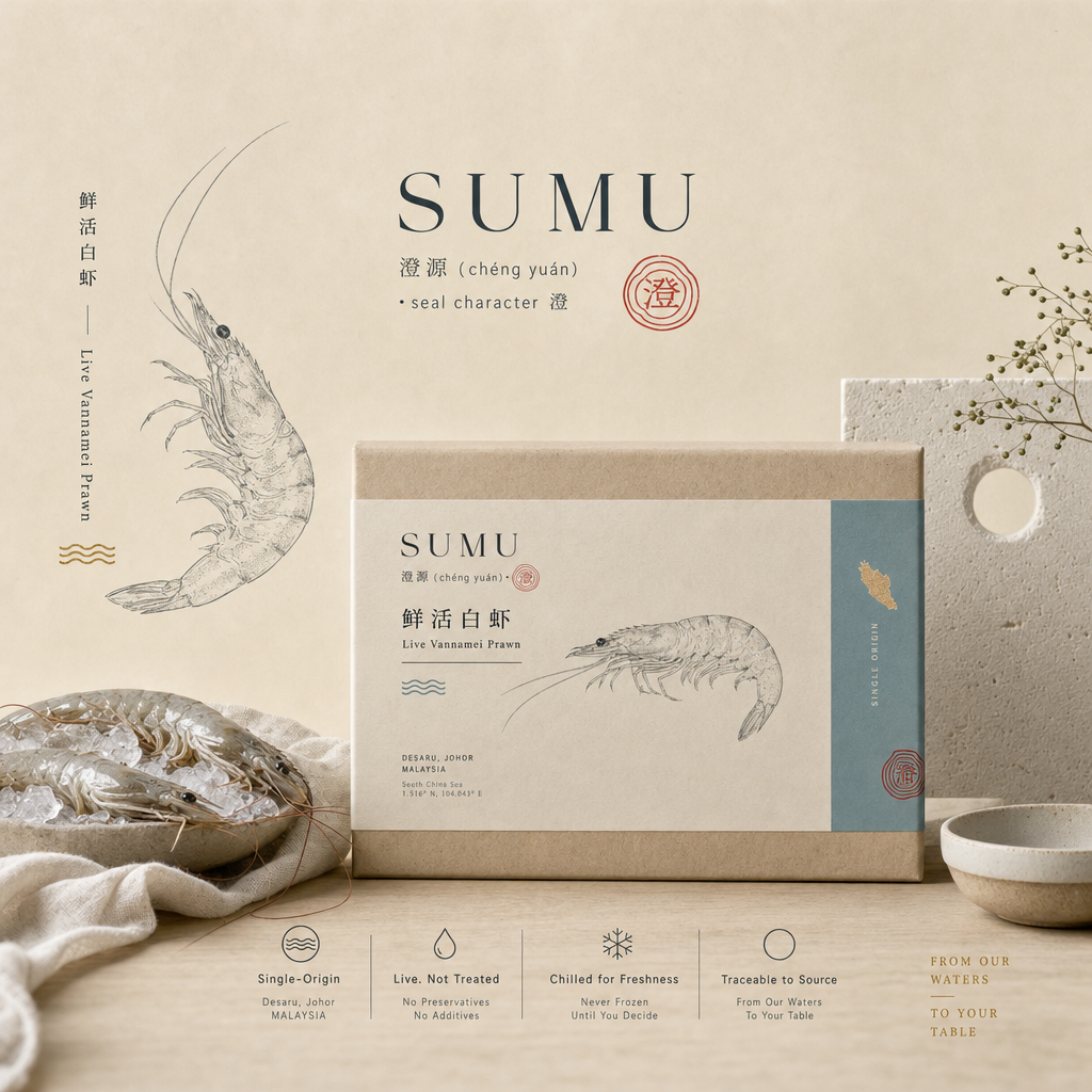
SUMU 澄源 (chéng yuán) · seal character 澄

Raised clear. Never netted. · 澄水养成,一网不撒

Panel 65/100Buy-intent SG ~42% / MY ~31% would buy or seriously consider (blended ~37%). SG over-indexes because the MUJI/Japandi grammar is native to its design-literate wellness cohort; MY drops because Japandi reads foreign/cold to the local-pride foodie and the calm register under-signals value to native-price shoppers.
Generated brand key-visual — SUMU

AI-generated brand key-visual (gpt-image-2, reference-first · 9.6/10). Wordmark text is AI-rendered — to be reset by a designer.

Reference basis

Grounded in: MUJI · 天和鮮物 THO · SunnyHills — and this direction's own art-direction spec.

The identity

Full brand direction.

Sea-life story
Told by SUBTRACTION, never by plea — the MUJI honesty move ("we omit the bleaching, so the paper is beige"). SUMU never says "we save the ocean." It states the omissions as neutral fact and lets the emptiness carry the feeling: "No nets. No bycatch. No emptying the sea — just one clear farm." The hero device is the vast unbleached-paper field with a single prawn floating in it — the ma (negative space) IS a reef left un-dragged, an ocean given room to breathe. A dragged net empties a whole reef to fill one box; SUMU fills yours from a single traceable farm. The claim stays honest and defensible (BTRF/R88): we don't overclaim ocean-positivity, we name the specific things we do NOT do (no net, no bycatch, no antibiotics) and the specific single-origin facts we CAN prove. The red 澄 seal is the one quiet trust-stamp; the spec-label is the moral argument.
Positioning
The MUJI of seafood — clean protein, raised clear, farmed-not-netted. A design-led wellness-premium live-seafood brand where restraint itself is the anti-greenwashing proof. Not "loud premium gifting" (that's the CNY red-gold default) and not "commodity fresh-fish" — SUMU is considered, honest, spec-forward calm: the single-origin farm that lets the sea be still.
Logo concept
Wordmark-first "no-brand" system. SUMU set in a refined Nordic-editorial serif (Ivar-family), tight but airy, low-contrast — never oversized. Paired with the ONE point of colour: a small hanko seal carrying 澄, the origin-as-symbol mark (per Wildtype's "roe the salmon grows from"). The seal glyph is a single continuous ripple/contour that doubles as (a) a water ring settling to stillness and (b) a stylised single-cell/breeding-origin dot — the Nucleus Breeding Centre as symbol. Monoline, single-colour-capable, legible tiny (WhatsApp avatar, Meta profile, moulded-pulp lid, box corner). Full lockup carries a wide-tracked small-caps descriptor line: "FARM-RAISED · ANTIBIOTIC-FREE · SASHIMI-GRADE AT HARVEST · SINGLE ORIGIN". The seal is also the standalone social/sticker avatar.
Illustration
Single-weight, reverent specimen line-drawings (sumi-e inflected, not cartoonish) of the vannamei prawn and the dragon-tiger grouper — the Patagonia-Provisions "remind you it was a living creature" device, rendered with Japandi calm. One hero animal per SKU, isolated in vast paper space. Supporting marks: a minimal seigaiha (青海波) wave motif used sparingly as a rule/divider, and a quiet single-origin map/diagram (Nucleus Breeding Centre → Desaru 244ha farm → your table) printed inside the lid. Texture comes from real washi-paper grain and unbleached kraft fibre, never added graphics. Real PHOTOGRAPHY is reserved for the money shot only — a glistening sashimi-grade prawn cross-section or ikejime grouper on light oak/ice, editorial-documentary, natural side-light, MATTE not glossy. Line-art carries the story; one hero photo carries desire. Never: literal net/bycatch imagery, mascots, gradients, aquarium-blue stock splashes.
Typography
Two-part editorial system with a CJK third layer. DISPLAY / manifesto serif: Ivar Display (Letters from Sweden — the Nordic bridge that makes this Japandi, not pure Japanese) or Reckless (Displaay) as alt; used for the emotional spine ("Raised clear. Never netted."). BODY / proof-layer sans: Söhne (Klim) or GT America — quiet humanist grotesque for spec data, weights, harvest facts; set small, wide-tracked small-caps on labels ("certified/spec-sheet" read). CJK: Source Han Serif / 思源宋体 (Noto Serif CJK) as the primary Song/Ming face so 澄源 carries heritage weight for the Chinese-majority market; A-OTF Ten Mincho or Ryumin for any Japanese-register vertical (tategaki) gift lockups; Zen Maru Gothic reserved as a warm rounded option for approachable pack labels only. NO bold-sans Chinese, no display shouting, no drop shadows — type is information, air is the styling.
Art direction
Documentary-natural-light, matte, product-as-hero. Surfaces are unbleached paper, light oak, raw linen, pale ceramic and clean ice — the Japandi "mist-over-mountains, sand-against-stone, sunlight-through-shoji" register. Ma (間) negative space is the primary compositional tool: one hero object isolated in a large calm field, wide margins, a strict grid with a single focal point. Recurring premium tell = the designed SPEC PANEL treated as a hero visual (origin, method IMTA/probiotic, generation Phi-Tik 49th, harvest ikejime, sashimi-grade, weight, harvest date) rendered like an honest ingredients tag, not fine print. Motion (video) is slow and still — a single prawn on ice, condensation forming, one clean ikejime beat, water settling to glass — the antithesis of frantic seafood ads; stillness signals control and freshness. Colour desaturated always; festive warmth enters ONLY as a washi-sleeve skin.
Ad style
Meta creative is quiet, editorial and claim-led — never hype. Four repeatable formats: (1) MANIFESTO STILL — oat/paper or light-oak field, serif line ("No nets. No bycatch. Just one clear farm."), single line-drawing, 澄 seal. (2) SPEC-AS-AD — the traceability panel screenshotted as the whole creative ("Antibiotics: none. Nets: none. Origin: one farm."). (3) HONEST-COMPARISON — "net-caught vs. one clear farm" told with restraint, no gore, no guilt-dump (imply the off-frame net, show only the clean single origin). (4) HERO-DESIRE PHOTO — sashimi cross-section, minimal caption. Carousels run nendo "haiku" pacing: one fact per card. Video is slow/still. Every ad ends on a soft, spec-backed WhatsApp CTA ("Read the label →"), never a discount scream. CNY: keep the editorial shell, add the washi-sleeve gift hero + vertical calligraphy, let deep-red/gold enter only as a seasonal skin.
Packaging
Unbleached moulded-pulp / kraft outer box (the beige colour IS the honesty signal — no bleach), MUJI-style spec-label as front-of-pack hero, single embossed/spot-foil 澄 hanko seal as the lone colour. Light-oak-tone paperboard insert cradling the live prawn/grouper; inside-lid prints the single-origin map (Breeding Centre → Desaru → table) + reverence line-drawing. A plain tabular spec/ingredients tag treated as a designed element, not fine print. GIFT & CNY tiers: washi-paper sleeve with vertical sumi calligraphy of 澄源, warmed to sage/charcoal/warm-white with the single vermilion seal — restraint scaled UP to luxury (Suntory "Takumi" register), the antidote to red-gold maximalism. Fully recyclable pulp/paper, no gloss lamination except the optional spot-foil seal.
Primary ICP
PRIMARY: SG Chinese-majority wellness-premium households, 32–55, design-literate (MUJI / Muji-House / Japandi-interior affinity), clean-eating and "sashimi-at-home" buyers who read labels and pay for provenance — reached via JML + Meta/WhatsApp. The Japandi-clean, spec-honest register is exactly the credibility signal this cohort trusts (restraint > clutter for seafood freshness), and it de-risks the at-market premium by making it feel earned rather than marked-up. SECONDARY: (a) CNY / festive & corporate gifters who want understated luxury (質素 refined-plainness) over gaudy gold-red abundance — the washi-sleeve gift register serves the S$159/S$310 tiers; (b) MY native-priced urban wellness buyers (KL/PJ/JB) who read Japandi as modern-premium. The style fits because this audience already equates calm, uncluttered, "no-brand-quality" design with health, honesty and freshness.
Pricing posture
Restraint is the WTP lever: MUJI/Japandi calm + a designed spec-receipt removes the "why am I paying premium?" friction, so buyers read the at-market price as fair-for-quality rather than a markup. Holds the TOP of the at-market-premium band on the core SKU — SG live vannamei ~S$38/kg (vs Seaco S$39.90) reads as the honest, considered choice, not the expensive one — and comfortably banks the +10–20% consumer premium ceiling. The washi-sleeve "considered luxury" (質素) register is what lets the GIFT/FESTIVE tiers reach into the thin ultra-premium +30–40% band without gaudy discount-gifting: hero combo S$83 (1kg prawn + 1 grouper), gift S$159 (澄·双喜 2kg + 2 grouper), festive S$310 all read as design-object gifting, so price resistance drops at exactly the CNY spike (the #1 revenue moment). Reprice standalone grouper down to ~S$48 (the S$54 was over-anchored). MY priced NATIVELY, never FX-translated: prawn ~RM62/kg, free-ship RM150 — same restraint story, native numbers. Net: SUMU shifts perception so the premium feels EARNED, protecting margin at the core and lifting it at the gift tier.

Sample Meta hooks

The 500-persona panel

How the market reacted.

Scroll-stop59
Desire60
Buy-intent56
Price-OK63
Sea-story61
Distinct81
Share56
Believe78

Best ICP

Sashimi-at-home entertainer (design-literate, MUJI/Japandi-interior affinity, label-reading provenance buyer) — this cohort scored it highest; the spec-honest calm register is exactly their credibility signal. Clean-protein mum was a close second.

Top objection

"It's too quiet and cold for the one moment that matters — CNY reunion & gifting expect abundance, red-gold generosity and visible 'face'; a beige minimalist box reads as expensive-plain rather than celebratory." The washi-sleeve sub-skin mitigates but does not fully neutralize this at the #1 revenue spike.

Panel verdict

A high-integrity, category-of-one distinctive brand that wins the design-literate SG wellness core on believability and provenance — but trades away appetite-heat and stumbles at the CNY festive spike where restraint fights abundance expectations; a strong niche/premium play, not the broadest mass winner.

Who loves it · value · conversion

The buyer this brand converts.

Best-fit ICP

Sashimi-at-Home Sophia (Clean-Protein Mum Wei close 2nd)

Conversion Lowest desire of the nine (PI 56, overall 65). Blended 65. Buy-intent 37% x PA 63. Converts design-literate entertainer + label-reading mum; festive S$310 splits panel (under-generous face).

Value Dual entertainer+mum fit gives some LTV depth, but the coldest festive read caps the #1 CNY revenue spike. AOV mid, gift soft.

Expected-value score: 70/100

ICP love profile

Sashimi-at-Home Sophia84
Clean-Protein Mum Wei72
Gift-a-Feast Gordon58
Reunion-Dinner Mrs Tan44
Johor-Proud Jason 40